'Heavy'

INVOCATION

UGANDAN METHODS

les disques du crépuscule

various artists
some of the interesting things you'll see on a long-distance flight (tape)
les disques du crépuscule (1982)
twi081
Live recording of the "Dialogue North/South" tour in February 1982.
This release comes without a tracklisting but includes tracks by: Richard Jobson, Tuxedomoon, Paul Haig, The Names, Marine, Durutti Column...
The "Inbetween" tracks are taken from Serge Gainsbourg's soundtrack to Goodbye Emanuelle (aka Emanuelle 3).

FEAR GENERATOR X


FUCK. THIS.
Metahaven grew from a frustration with graphic design’s well-worn paths. When Kruk graduated in 2003 from the Willem de Kooning Academie in Rotterdam, she faced essentially two choices: work for the larger, more corporate companies, or go into the cultural field, which in her view was already explored to the limit. ‘But there wasn’t a space in graphic design where I felt there was a field for theory or something that you could develop without it being finished,’ she says, in the Amsterdam studio she shares with Van der Velden (Zifroni, not present, works in Brussels).

‘There is an ultra-short incubation time that every piece of graphic design has to go through,’ adds Van der Velden. At the end, the message is focused and anything deemed to be extraneous is eliminated. ‘We need a space where we can work on things without there being this funnelling or bottleneck moment where that happens.’
Eye

MAGNASANTI

ARMADASANTI
PARASANTI
MAGNASANTI

the fractal motherplex

Distortion : Preservation


1 of 3 spreads for a zine being published this coming summer by O Fluxo.

spiraled 'O'

spiraled 'O'

Shotaro Ishinomori

A bronze statue of Shotaro Ishinomori's (石ノ森 章太郎 Ishinomori Shōtarō) hand outside of the Mangattan Museum

Japanese manga artist who became an influential figure in manga, anime, and tokusatsu, creating several immensely popular long-running series such as Cyborg 009 and Himitsu Sentai Gorenger, what would go on to become part of the Super Sentai series, and the Kamen Rider Series. He was twice awarded by the Shogakukan Manga Award, in 1968 for Sabu to Ichi Torimono Hikae and in 1988 for Hotel and Manga Nihon Keizai Nyumon.[1] He was born and named Shotaro Onodera (小野寺 章太郎 Onodera Shōtarō?) in Tome, Miyagi, and was also known as Shotaro Ishimori (石森 章太郎 Ishimori Shōtarō?) before 1986, when he changed his family name to Ishinomori with "".


f''real RIP Mika Miko

ha.
workshop records stamps

glitchin'

But if you get up real early--say 4:30--and look around,
you'll see the world before the cynics have got out of bed.

CL promo

11x17 broadsheet promotional piece for CL

New CL business cards, black gloss on matte black

CL - signage


Neon signage I designed for CL.

Books on books about books for books

 [Image: Exposition "Do You Read Me?" à l'elac]

Do you read me? No. I bought you and now you sit on a shelf amongst the other trophy books. But why? I love books! ...or I think I do...
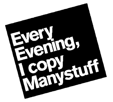
I mean I love how Arial is tilted at 30 degree angles alternating across your cover. I love your freely placed images dancing into the gutter and off the margins. But I don't understand you. What are you about? What are you worth? Why are you simultaneously exciting to look at but boring to read?

There are way too many boring books about internet culture, internet art, memes, hastags, tweets, etc... Printing off the internet or what amounts to one's image aggro Tumblr into a book in monotone for images that are otherwise stunning on our HD screens is, to me, an illogical and inappropriate use of the book medium. A lot of designers do this. It is a trend within a trend (and I love trends). I understand self-publishing limits the ability to print in multiple colors and one is left with that restriction to work against. That's all fine. What I find disappointing is the lack of consideration of context and the pursuit of self-serving publishing. As an art object, the book can act as a piece devoted to no-one or only the creator (Tauba Auerbach's artist books come to mind), but I'm talking about commercial books to be sold, made by graphic designers not artists. These designer books join in the history of the book as a symbol of status and luxury and it's pretty obvious that many designers are engaged in the pursuit of some sort of acclaim associated with publishing. There is a do-it-all-by-yourself mentality prevalent in the designer publishing culture that I think is detrimental to the quality of the content. D.I.Y. doesn't have to mean all-by-yourself. Maybe this comes from the artist zine culture, sort of a misunderstanding that got mixed in. Either way, collaborate. Work with a writer. Find people. Help people express their ideas. Help other people understand those ideas. Yes, there will always be a niche of collectors and fellow designers, but if making a book for a book about books in the bookshop is where the project ends, we've not done our jobs as designers communicators in 2012.

Heartless Poster


Revised poster I designed promoting a free concert by Heartless Bastards. I prefer this one to the other one I posted last week.
THE GENERATION BEHIND IS SUPER SERIOUS AND HYPER CONNECTED, BUT THEY COULD GIVE A SHIT ABOUT BLOGGING THEIR EXISTENCE WHEN THEIR EXISTENCE IS SO THREATENED


Starfighter from Grafik des Kapitalistischen Realismus (Graphics of Capitalist Realism) portfolio Wolf Vostell 1968 screenprint, glitter on paper