

TOTAL LOSS
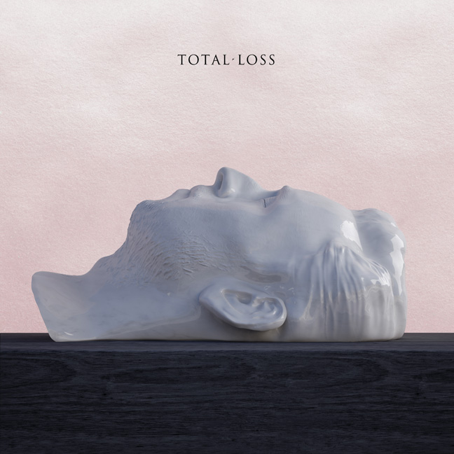
Cover Josh Clancy and I art directed for How To Dress Well's forthcoming album. It was featured yesterday as Print Magazine's image of the day.


PINE-SOL WILL SCARE YOU CLEAN
In this ad for Pine-Sol (of all things) their spokesperson bursts from behind (of all things) a thin Pine-Sol banner not surprising the unsuspecting consumer but in fact scaring the living shit out of them. The spokesperson (who appears to have huffed a bottle) leaps from behind the veil and screams something like: BUYPINESOLYOUNEEDITWEHAVEITHURRYNOWBUYBUYBUYTHISWORKSPINESOLYEAH!
while the consumers blood pressure skyrockets. At least they looked up from their iPhone for a moment to notice the sparkling freshness of Pine-Sol.
What does this tell us? I think it indicates that everyone is so distracted that the competition for attention in our info glut society is becoming increasingly fierce and advertisers are desperate to make any kind of connection with the average consumer (e.g. wage slave, human resource).
Olympic Games
I find it interesting that hovering above all the preparations and anticipation for the 2012 Olympics is the ominous cloud of collapse and suffering looming over Europe, particularly Greece which gave us the original Olympics. Alias made this post about the Olympic identity being used for protest and anonymous trolling. In their final remarks they state: "We rail against the lack of restraint of bankers, fat cats or MPs, but can we restrain ourselves?". This is a good point, but I kept thinking about the meaning of self-restraint in design. Why is it imposed on us and why do we impose order on other designers? In a previous post they talk about a poorly made version of the 2012 Olympic font being ripped off and distributed across the internet.
I think what isn't found in their discussion is that if the leaders and social elites are acting with reckless abandon, then why should one expect anything else but a complete disregard for moral authority? This point was discussed at some length last summer when riots and looting erupted across London. Are designers supposed to be the sword wielding moral knights that must descend from the clouds to return everything to order? And is branding an event like the Olympics, an event which generates loads of money for the host country, not just another system of control heaved on people? Are we undergoing a design insurrection?
I think these rip-off visual critiques, however morally abandoned they may be in execution, come from a genuine, grassroots discontent. It's appropriating the symbols of power to create counter-messaging and new meaning. Believing in this, I decided to make these posters about the atmosphere surrounding and leading up to the 2012 Olympic games; to pair the aesthetic crimes with the austerity crimes being perpetrated in Spain, Italy, Belgium, and most of all Greece as the Eurozone seems held in imminent death. Rings interlocking with other rings like the snake eating it's own tail.


There are freeware copies of the font that are somehow exact matches of the original. These must have been cut and paste from original data. Used without authority, without adherence to guidelines, matching typestyle but disconnected content, these are more damaging. Having read about the litigiousness surrounding the use of the Olympic rings, I’m surprised other facets of the identity aren’t being so protected.
I think what isn't found in their discussion is that if the leaders and social elites are acting with reckless abandon, then why should one expect anything else but a complete disregard for moral authority? This point was discussed at some length last summer when riots and looting erupted across London. Are designers supposed to be the sword wielding moral knights that must descend from the clouds to return everything to order? And is branding an event like the Olympics, an event which generates loads of money for the host country, not just another system of control heaved on people? Are we undergoing a design insurrection?
I think these rip-off visual critiques, however morally abandoned they may be in execution, come from a genuine, grassroots discontent. It's appropriating the symbols of power to create counter-messaging and new meaning. Believing in this, I decided to make these posters about the atmosphere surrounding and leading up to the 2012 Olympic games; to pair the aesthetic crimes with the austerity crimes being perpetrated in Spain, Italy, Belgium, and most of all Greece as the Eurozone seems held in imminent death. Rings interlocking with other rings like the snake eating it's own tail.


Interesting and relevant

One thing that is becoming more apparent in design work and on an even greater level, in society, is the focus from striving to be right v. wrong (rich v. poor being the financial equals to these two) to focusing on the interesting and relevant. For instance, I read some comments from a news blog post about the Bilderberg conference. If you don't know what that is, I suggest reading up on this year's here. In any case, one commenter on the news blog was arguing with another commenter about how one becomes a conspiracy theorist, why they exist, and what it means to seek the truth. The second commenter wanted the first to realize that looking at the facts should be sufficient. The first commenter argued that facts weren't sufficient sources for investigation because they came from broadcasts funded by corruption. Irregardless of which side one stands on, this dispute is about the right to be right. The right to be first. Being validated, seeking reward. These things have nothing to do with how interesting or relevant the information is that both commenters seek.
This distinction, moving away from right v. wrong, has it's purpose in design as well since communication is often concerned with responses of reward or punishment. Often designers are trying to design something the right way in order to be rewarded. How is a designer's work rewarded? Besides pay, it is talked about in the online social sphere. You're invited to make more work like it. You're passed along the conveyor belt of design inspiration. The key to the Design community's private drinking club is yours. When you make bad work, when you design the wrong way, you are punished. Or maybe the right word is banished. There is little you can do to protest since critical discussions are severely lacking amongst the design community, both online and offline.
I guess my point is both scenarios do a disservice to real communication in the long run. Choosing to make work that seeks a quick reward is no different than being ignorant or trying to make work that is different for the sake of being different. The only way out is to concentrate on designing messages that are interesting and relevant and to keep this in mind when discussing the work with other people.
Subscribe to:
Posts (Atom)